Poly Publishing
Logo Design, Identity Design
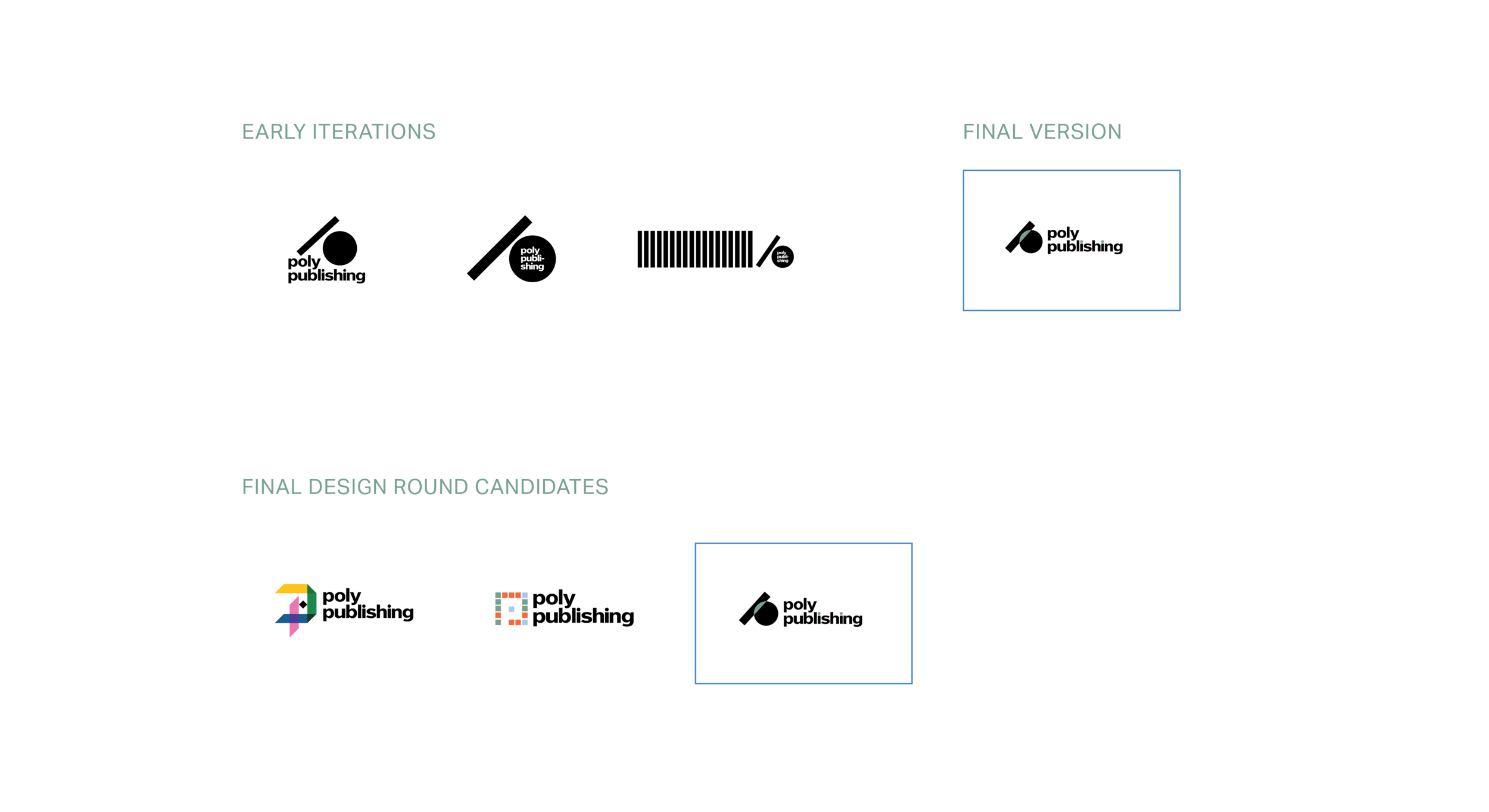
Poly Publishing represents a reimagined approach to the circulation and review of information. The interlocking forms within the logo symbolize the evolution from traditional to digital publishing, capturing a sense of transition and continuity. This shift to digital platforms creates opportunities to challenge established conventions and broaden access to knowledge.
Designing an identity from the ground up for the nontraditional space of digital publishing required a focused and intentional approach centered on the client’s vision. While my initial references spanned a wide and varied range, reflecting the breadth of possible creative directions, I ultimately refined the process by anchoring each decision in the client’s goals, allowing a clear and cohesive identity to emerge.


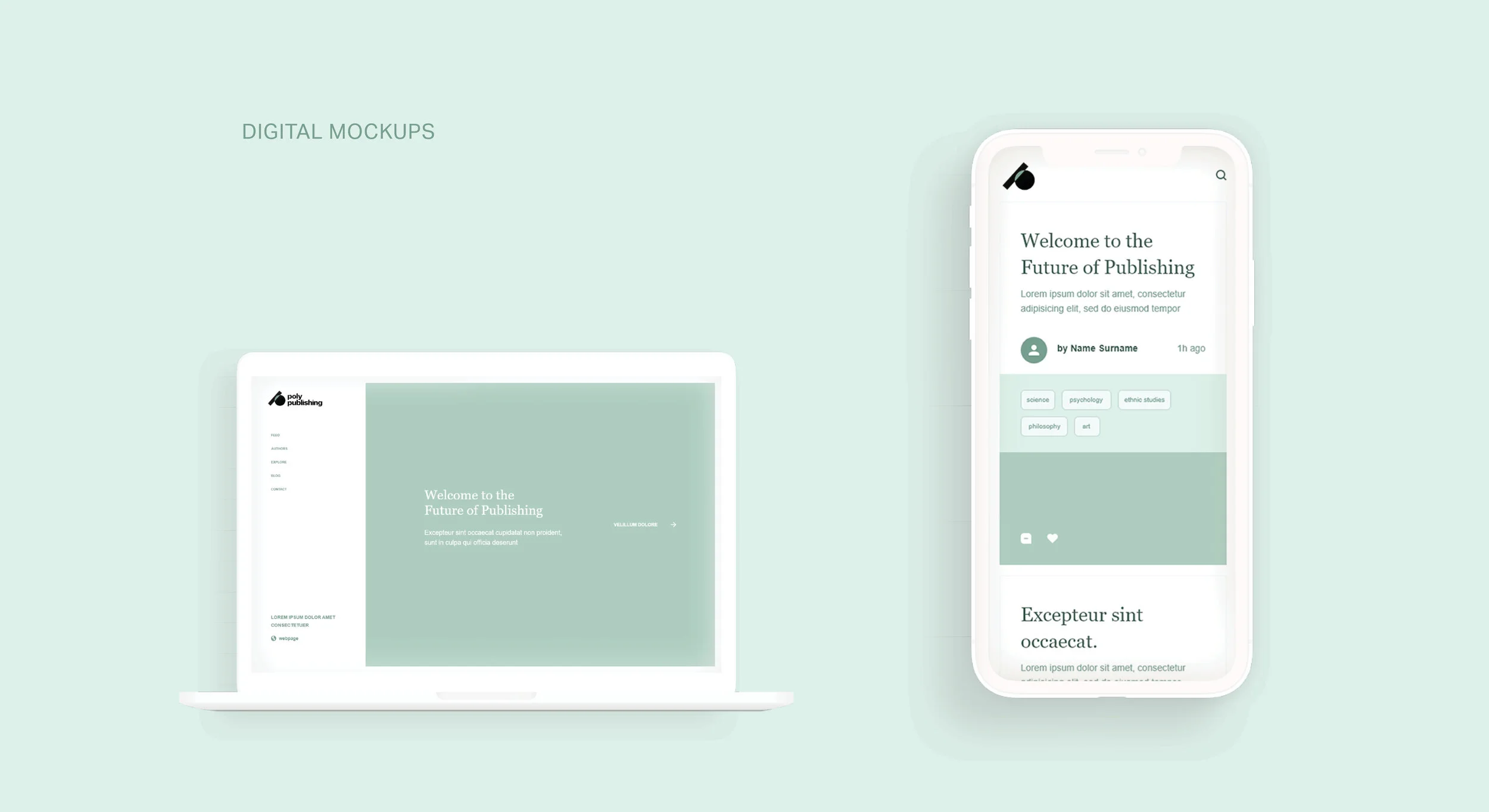
While I developed the identity, its long-term success depended on student designers who would continue to implement and evolve it. Recognizing that they would engage most deeply with the system, I intentionally kept the design clear and adaptable. It serves as a flexible foundation—allowing future designers to extend the visual language by incorporating the logo’s colors and elements in ways that respond to the project’s ongoing development.