
Bright Pattern Workforce Management System
Procreate, Adobe XD, Figma
Product Design, Ideation & Prototyping, Systems Thinking
Position: Lead UI Designer
Bright Pattern builds cloud-based contact center software used by enterprise teams managing high-volume customer service operations. My work centers on making complex, real-time operational data readable and actionable for supervisors and agents working under pressure.
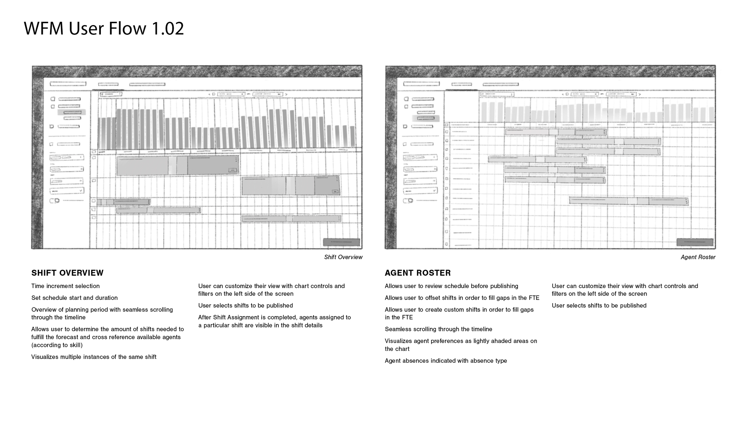
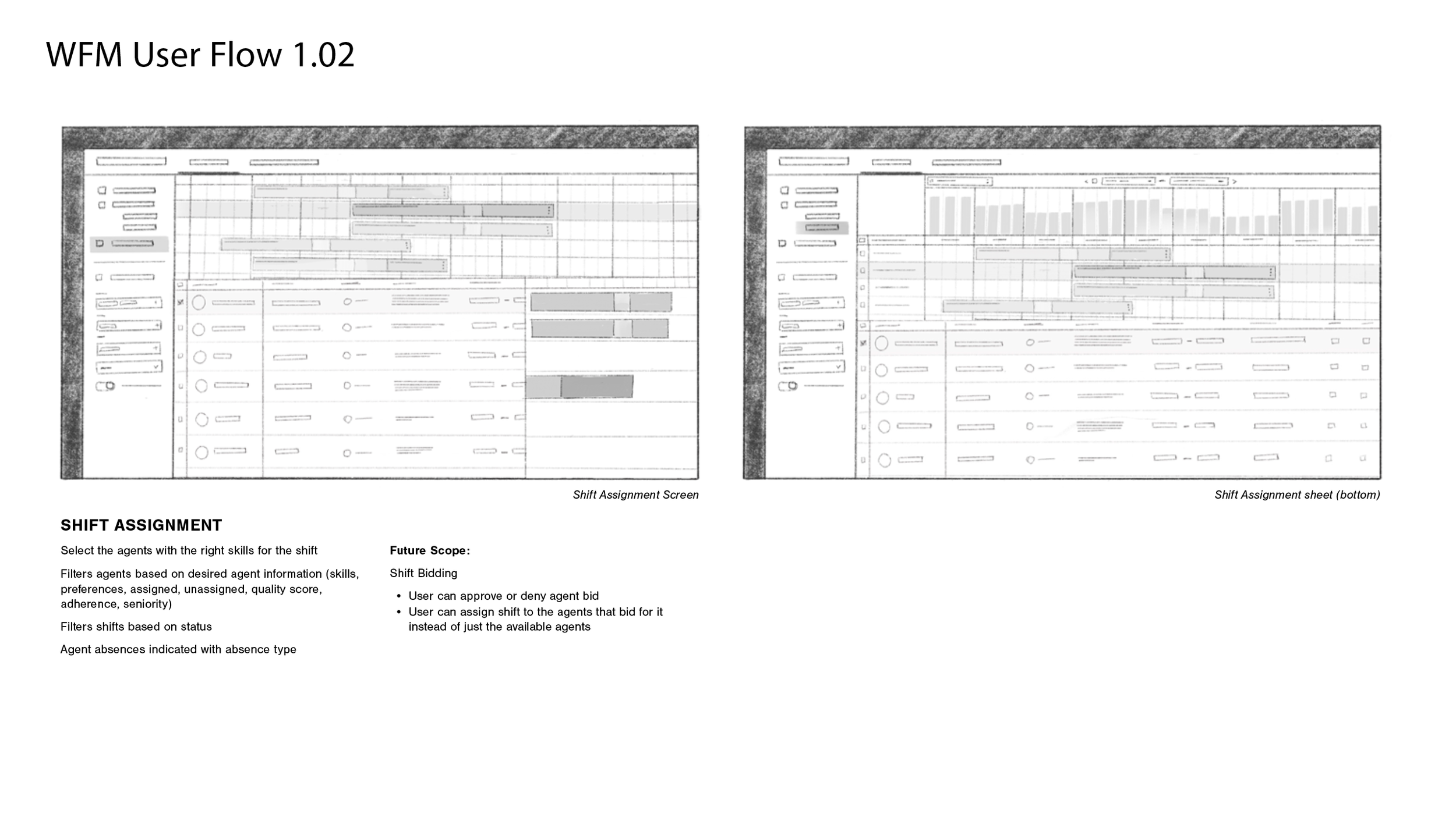
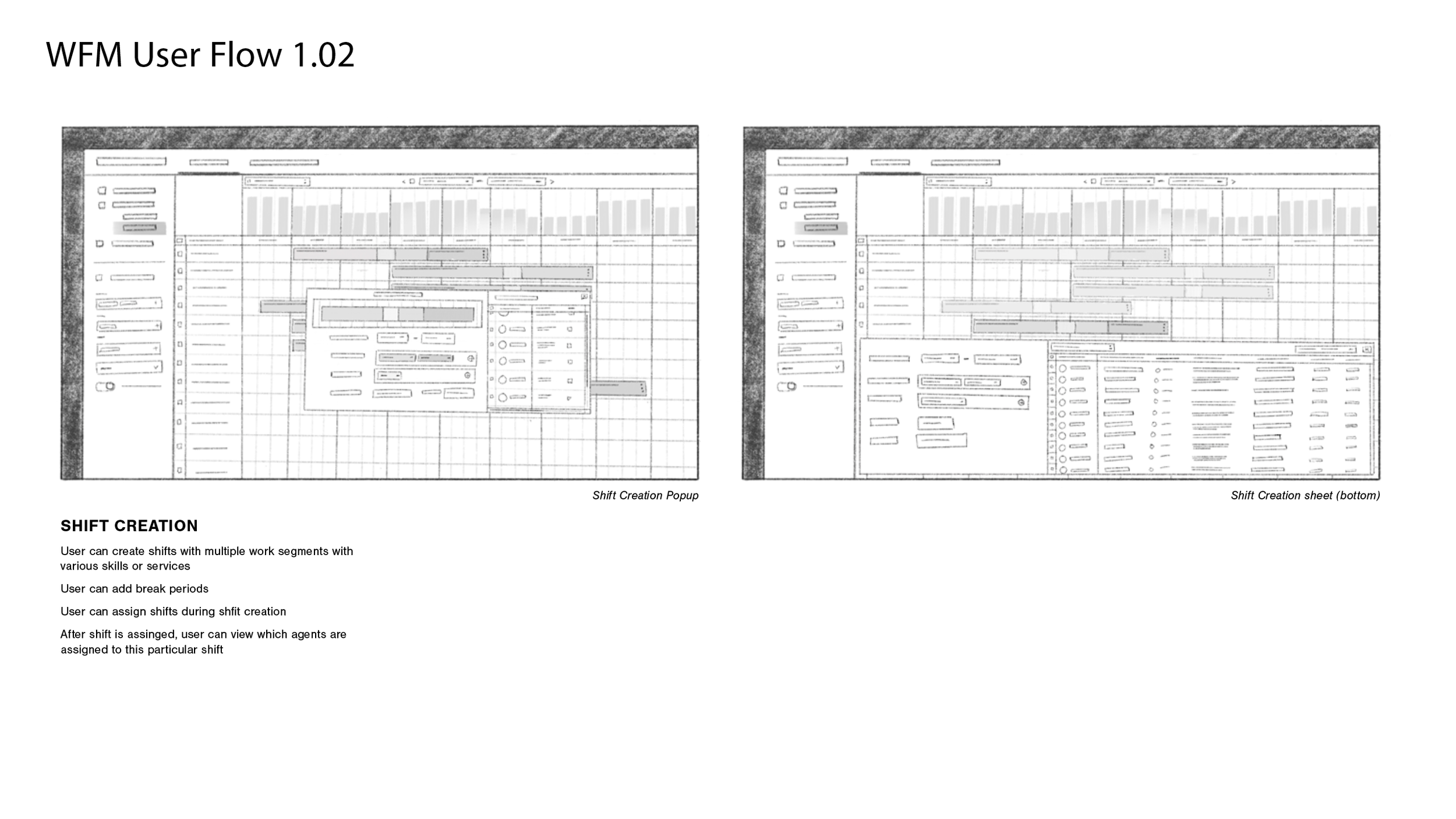
Contact center supervisors don't just manage people, they manage time. A shift scheduled incorrectly by an hour can mean a surge of unanswered calls, frustrated customers, and a team scrambling to recover. Bright Pattern's new workforce management feature needed to give supervisors a clear, fast way to build agent schedules against predicted demand, and let them see the impact of their decisions in real time.
The Problem:
Workforce management is an inherently data-heavy problem: demand fluctuates by hour, by service channel, and by day. Competitors like Zendesk, Genesys, and Calabrio had solved for completeness but not for clarity; their interfaces presented so much simultaneous data that the relationship between a schedule and its coverage gaps was difficult to read at a glance. We heard this directly from contact center supervisors in interviews: they knew the information was there, but acting on it quickly wasn't.
Approach:
We anchored the interface in a familiar mental model: the calendar. Supervisors already think in days and hours, so we built the scheduling grid on that logic — agents laid out as rows, time as columns, shifts drawn by clicking and dragging like a Google Calendar event. The familiarity lowers the learning curve and keeps the focus on the scheduling decisions themselves.
The harder problem was demand visualization. Because demand represents an aggregate across multiple service channels, each with different peak times, a single graph would flatten distinctions that supervisors need to act on. We designed three complementary views: a bar graph comparing completed coverage against total demand, a heat map flagging understaffing and overstaffing broken down by service, and a numerical table for supervisors who need precise figures. Rather than forcing a single view, we gave users a toggle to display any combination, matching the visualization to how each person thinks, not how we assumed they would.
The critical design decision was to make these views live. As a supervisor draws or adjusts a shift, the demand visualization updates immediately, so the consequences of a scheduling choice are visible before it's confirmed. This turns what was a two-step process, build a schedule, then audit it separately, into a single continuous workflow.